
I’m back with an update on the broad market.
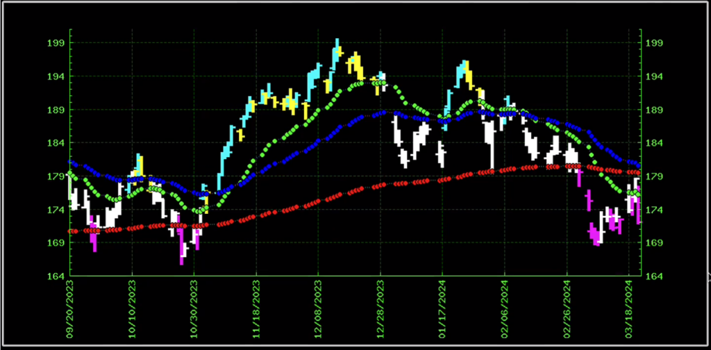
As you may know, I like to start checking out the broad market by looking at SPY.
And as you can see in this chart, this index has been trending beautifully.
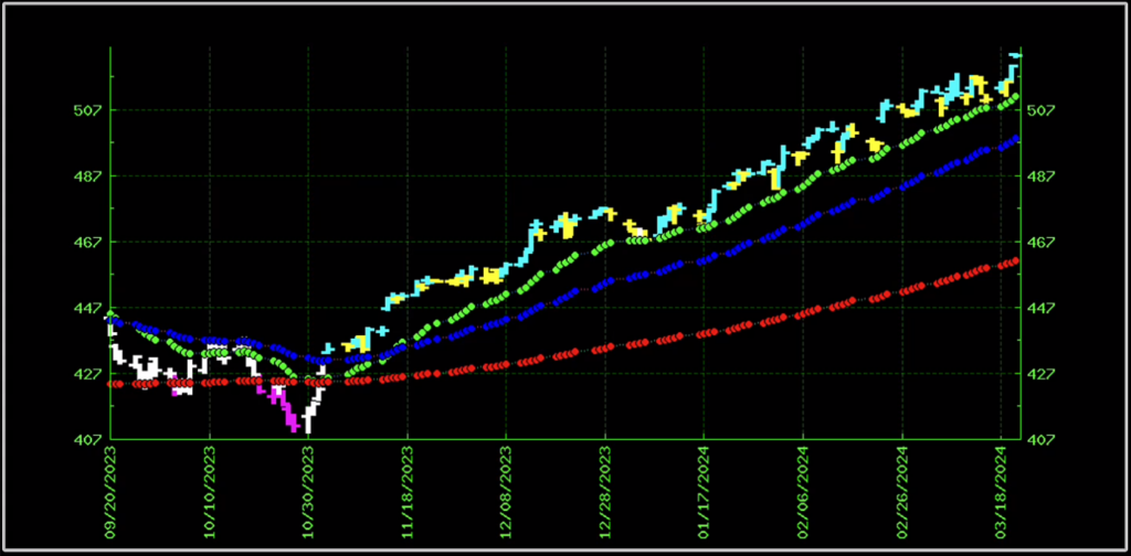
The green line is the short-term trend, the blue line is the mid-term trend and the red line is the long-term trend.
They’re all heading up and as you can see the price action of SPY — represented by the little teal and yellow bars — keeps bouncing off the short-term trend.
This represents a super strong, powerful, consistent trend.
What I want you to pay particular attention to is that despite the Fed, despite whatever noise you might hear out in the market… this chart shows the S&P has been trending — and continues to trend beautifully.
Next let’s look at the DIA. This is the ETF that tracks the Dow Jones.
And as you can see, it’s also headed up. All three trend lines are clearly pointing upward.
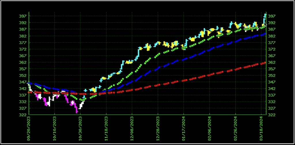
But it’s not AS BULLISH as the S&P. You can tell because there are certain places where the price action (remember, those are the teal and yellow bars) breaks through the green short-term trend line.
It hasn’t completely fallen through but you can see it’s pierced that lined a few times. Especially in the last few weeks we’ve been seeing more and more of that.
So far that’s 2 out of 3 of the major indexes in a bullish trend.
Let’s check on the last one, which is the Nasdaq. That index is represented by the ticker symbol QQQ.
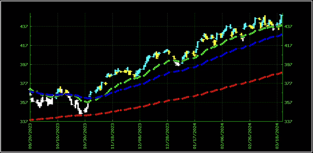
And as you can see, it’s also in a bullish trend, with all 3 trend lines headed upward.
Take a closer look. a closer look, though, you can see that it’s the most volatile.
How do I know? Compare how the price action (teal/yellow bars) on this QQQ looks compared to the other indexes.
The QQQ goes far away from the green line, then it comes slamming back down into it — and even through it in some cases.
It doesn’t keep an nice, steady distance from the short-term (green) trend line.
And that volatility is because the QQQ is loaded with tech stocks, which are known to be volatile.
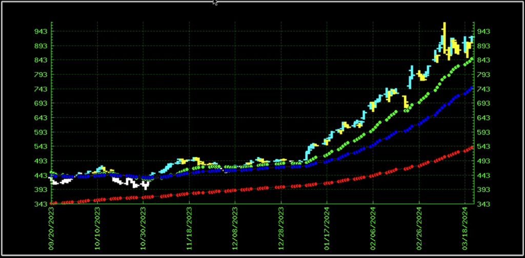
Speaking of tech, let’s look at TSLA.
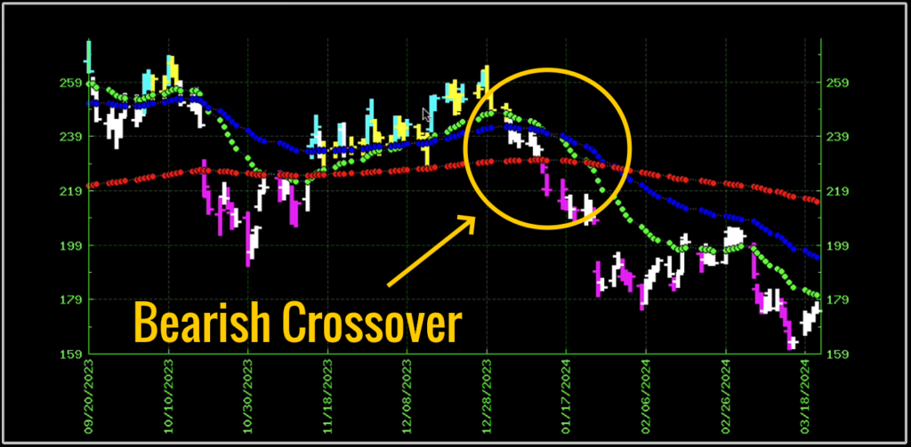
TSLA is bearish. You can see just how different the TSLA chart looks from any of the indexes we just looked at.
First of all, starting on the left side of the chart, there is no clear trend. The 3 trend lines are all crashing into each other and the price action is jumping all over.
Then about 2/3 of the way through, the trend lines all cross each other going into bearish territory.
And that last 1/3 of the chart is exactly the opposite of what we saw on the index charts:
The green short-term line is leading the charge downward, while the blue mid-term trendline follows it down, and the red trend line follows suit.
This clearly shows us that TSLA is in a bearish trend.
And right now TSLA doesn’t have any support. As far as this chart is concerned, it could keep dropping like a rock.
Now let’s look at AAPL.
AAPL is a tech stock that’s also bearish.
You can tell from the green short-term trendline crossing down below the other two trend lines.
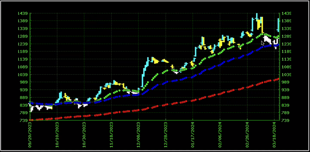
Now, on the opposite end of the spectrum, we have everybody’s favorite, NVDA.
You can see the strong bullish trend on NVDA and that stock just keeps ripping higher.
AVGO is an interesting one.
As you can see, AVGO was in a strong upward trend, but recently started to break down. See how the white bars go below the green short-term trend line on the right side of the chart?
But then today it got a remarkable bounce today due to an upgrade in the stock. That’s the single teal bar all the way on the right side of the chart.
Next let’s look at ANET.
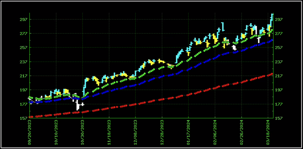
That looks like a beautiful trend. It looks like it’s going a lot higher to me.
What It All Means
So that’s my process when I approach trading.
I like to trade in the same direction as the broad market.
That’s why I like to start by looking at the trend in the SPY, the DIA and the QQQ.
And then I find stocks within those indexes that are trending in the same direction as the index and making new daily highs.
I talk more about this over here and even show you how to find hot stocks by looking for stocks making new 52 week highs!
Hope you enjoy.
Trade well,
Jack Carter


